
Italian champions Juventus have unveiled a new logo, but the Old Lady of Turin's minimalist rebrand has not gone down well with fans.
The club's new crest was revealed at a lavish launch party this week – in Milan of all places – where club president Andrea Agnelli explained the need for the new look, which sees the iconic black and white striped badge replaced by a stylised letter J.
Subscribe to The Week
Escape your echo chamber. Get the facts behind the news, plus analysis from multiple perspectives.

Sign up for The Week's Free Newsletters
From our morning news briefing to a weekly Good News Newsletter, get the best of The Week delivered directly to your inbox.
From our morning news briefing to a weekly Good News Newsletter, get the best of The Week delivered directly to your inbox.
Create an account with the same email registered to your subscription to unlock access.
-
 Ukraine using covert US long-range missiles
Speed Read The weapons are part of a $1 billion Ukraine aid package
-
 Arizona grand jury indicts 18 in Trump fake elector plot
Speed Read The state charged Mark Meadows, Rudy Giuliani and other Trump allies in 2020 election interference case
-
 Antony Gormley's Time Horizon – a 'judgmental army' of 100 cast-iron men
The Week Recommends Sculptures are 'everymen questioning the privilege of their surroundings' at the Norfolk stately home


-
 Mason Greenwood: footballer arrested on suspicion of rape and assault
Speed Read Man Utd confirm the striker will not train or play until further notice
-
 Handball: swapping bikini bottoms for tight pants
Speed Read Women competitors will be required to ‘wear short tight pants with a close fit’
-
 Cristiano Ronaldo’s second coming
Speed Read Last week, Manchester United re-signed the forward on a two-year deal thought to be worth more than £400,000 a week
-
 Bank holidays and boycotts: are MPs trying to jinx England?
Speed Read Declaring a bank holiday would be ‘tempting fate’, says Boris Johnson
-
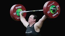 Weightlifting: Olympic Games set for transgender first
Speed Read New Zealand weightlifter Laurel Hubbard will make history at Tokyo 2020
-
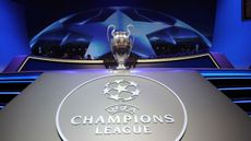 Sport shorts: Champions League expansion plan to be agreed
Speed Read News and reactions from the world of sport, featuring Joachim Low and the Lions women’s team
-
 Sport shorts: Sturgeon slams Rangers fans over title celebrations
Speed Read News and reactions from the world of sport, featuring Keely Hodgkinson and Bryson DeChambeau
-
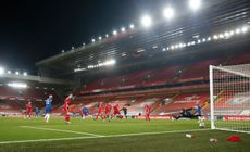 Sport shorts: Klopp’s unwanted record as Liverpool lose again at Anfield
Speed Read News and reactions from the world of sport, featuring Tiger Woods and Tom Brady


